two pictures of a brochure. The right one showes two pages with an a and an ä and the left one shows the binding of the brochure: no binding, the pages just lie in each one another

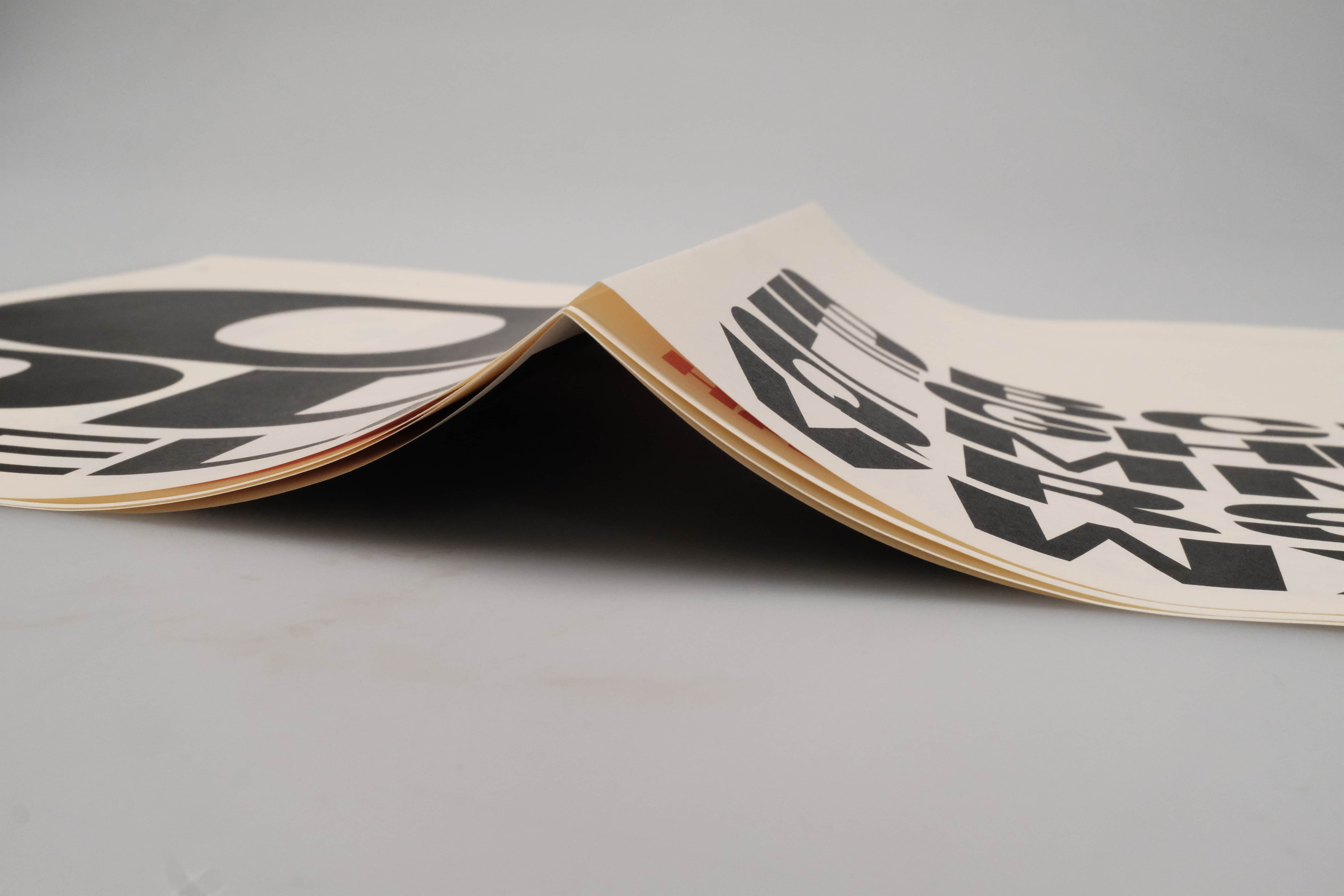
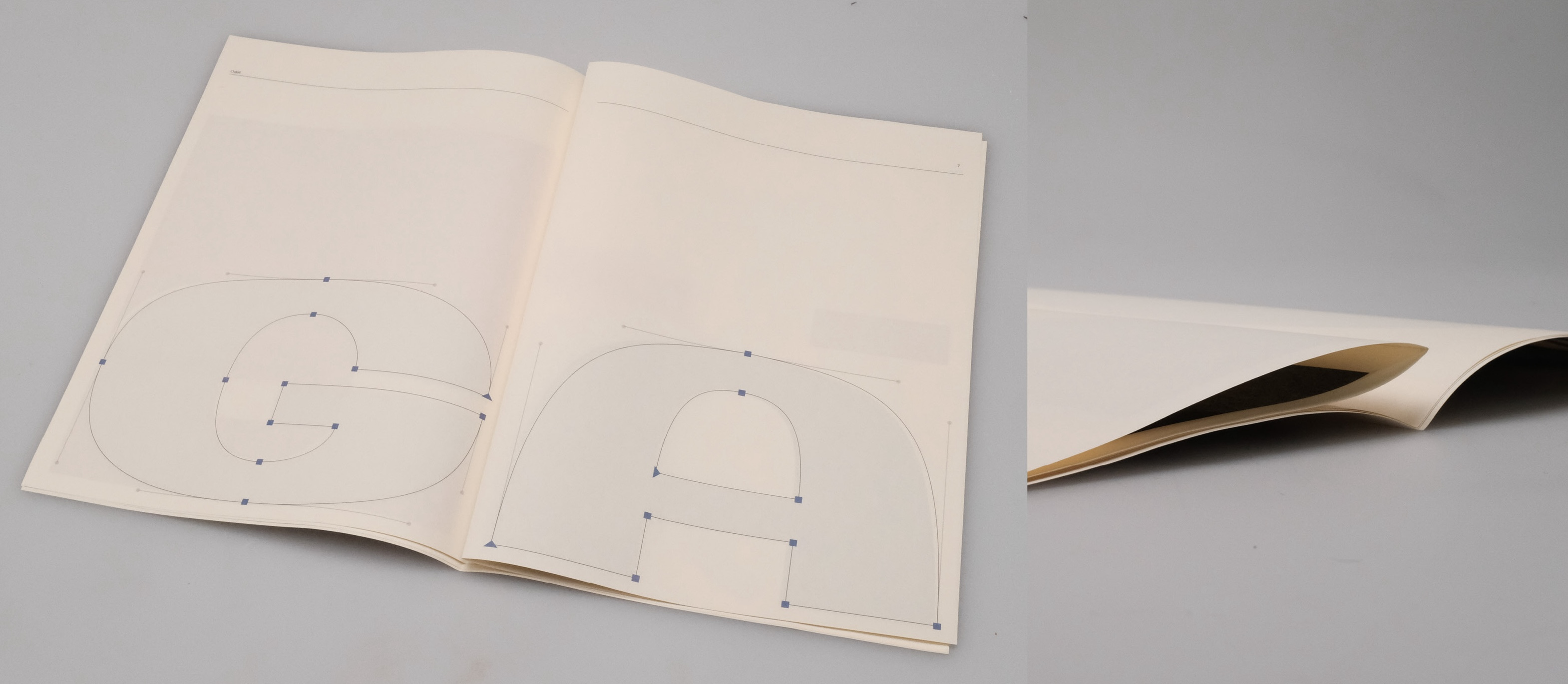
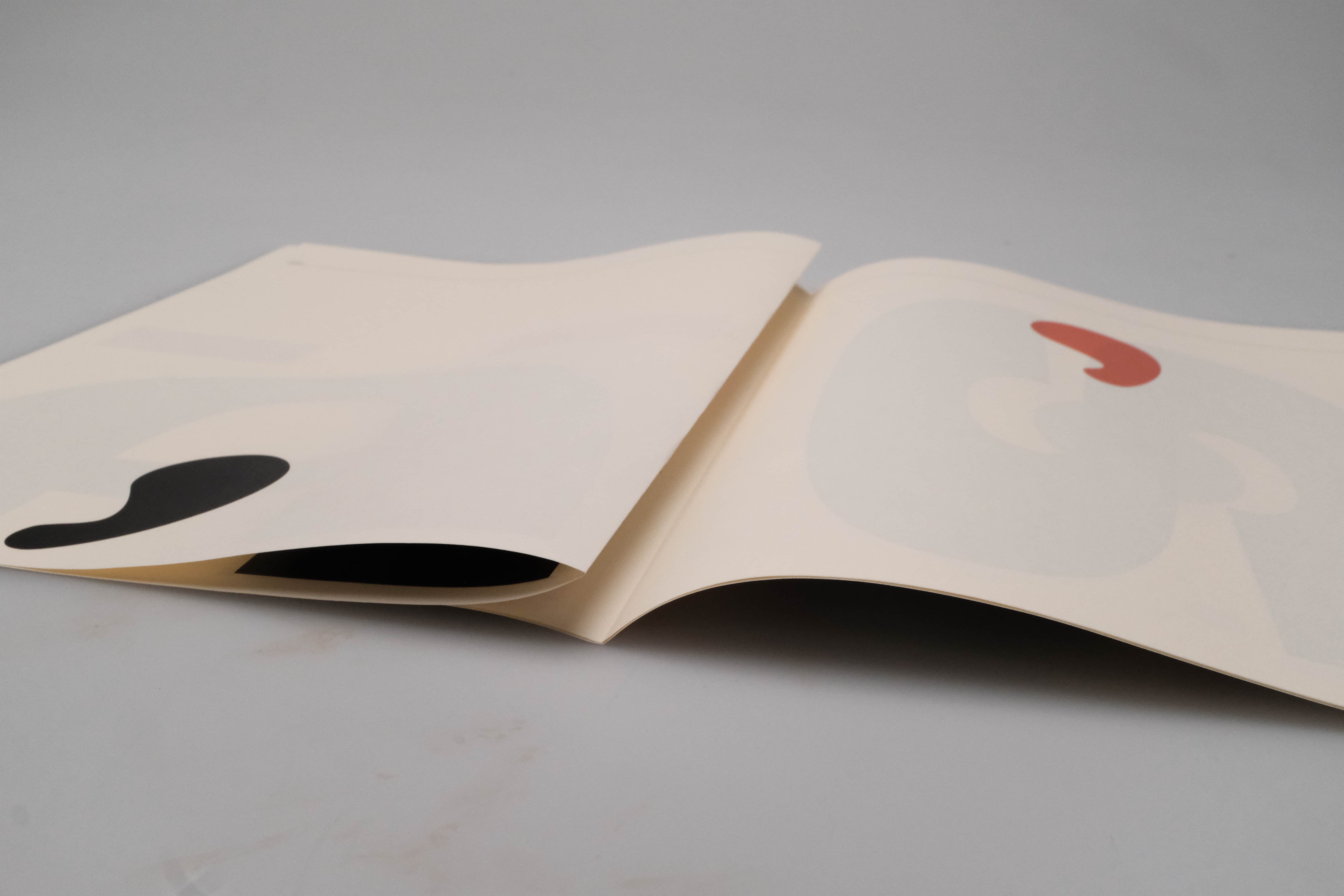
The typeface "Odell" is inspired by the visual language of a tour poster and translates musical expression into typographic form. It is characterised by the contrast between thin and thick strokes, which reflects the dynamics of Tom Odells music. His songs often shift between quiet, fragile moments and loud, powerful passages. My font is best used for bold letterings and headlines.

Three images, showing pages from A specimin. The 1rst page from the left has the Alphabet in Caps. It is arranged in a block and on the lower half of the page. The second Image has 'Odell' written on it, the o is on top and big, the 'od' is in the middle and a little smaller and 'Odell' is beneath and a little smaller. The 3rd page has a big black dot in it's center Three images, showing pages from A specimin. The 1rst page from the left has an orange background and a white, big G on it. The 2nd page shows the same G in beziers on a white background. The 3rd page shows the G in black on a white background Three images, showing pages from A specimin. The 1rst page from the left has big A in beziers on it. The 2nd page shows the same A in black, on a white background. The 3rd page shows the A withe two orange blocks above it Three images, showing pages from A specimin. The 1rst page from the left has a lower, black comma on the lower half of the page. The 2nd page showes an orange, upper quotation mark on the upper half of the page. The 3rd page has dots, kommas and quotation marks arranged in a pattern on it